

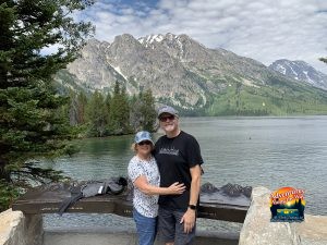


Closing One Chapter
Today was a bittersweet day as we handed the keys of our motorhome to its new owner. After seven years, close to 100,000 miles, and far too many memories to count, we close this chapter of our lives (at least for the time being). Seven years ago we could not have imagined the journey we […]


You must be logged in to post a comment.